
As a designer, artist, or simply someone who appreciates the power of color, you’ve probably heard of the “Color Wheel” – but what exactly is it, and how can it help you create harmonious and balanced designs?
In this article, we’ll delve into the world of color theory and explore the fascinating concept of the Color Circle of Itten, a groundbreaking system developed by renowned designer and educator Johannes Itten. We’ll discover how to identify primary, secondary, and tertiary colors, understand the principles of complementary colors, and apply these insights to create stunning visual effects.
What is the Color Circle of Itten?
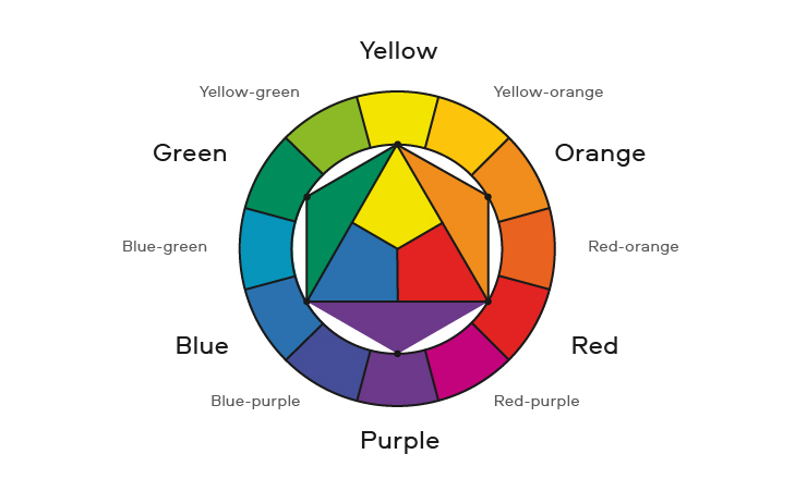
Developed by Johannes Itten in the early 20th century, the Color Circle of Itten is a visual tool that organizes colors into a harmonious and logical structure. This revolutionary system allows artists, designers, and anyone interested in color to understand the underlying principles of color theory and apply them to create visually appealing compositions.
Understanding Primary Colors
The Color Circle of Itten begins with the three primary colors: red, yellow, and blue. These colors cannot be created by mixing other colors together and are the foundation upon which all other colors are built. By understanding how these primary colors interact with each other, we can begin to appreciate the nuances of color theory.
Primary colors have unique properties that make them useful in design and art. For example:
- Red is a warm, vibrant color often associated with energy and passion.
- Yellow is a bright, sunny color that evokes feelings of happiness and optimism.
- Blue is a cool, calming color that can represent trust, loyalty, and wisdom.
Secondary Colors
When we mix two primary colors together, we create secondary colors: green (blue + yellow), orange (red + yellow), and violet (blue + red). These colors are not only visually appealing but also have unique properties that make them useful in design and art.
- Green is a balancing color that can represent growth, harmony, and nature.
- Orange is a vibrant, energetic color that can evoke feelings of excitement and playfulness.
- Violet is a creative, imaginative color that can inspire artistic expression and innovation.
Tertiary Colors
To create tertiary colors, we combine a primary color with a secondary color. For example, blue-green (blue + green) or orange-red (orange + red). Tertiary colors offer an exciting range of possibilities for artists and designers looking to add depth and complexity to their work.
Tertiary colors can also be used to create subtle shifts in mood and emotion, adding nuance to our designs and artwork. By understanding how tertiary colors interact with each other, we can create more sophisticated and engaging visual effects.
Complementary Colors
The Color Circle of Itten also reveals the secrets of complementary colors – pairs of colors that are opposite each other on the color wheel. These colors have a unique relationship, where one color enhances or “complements” the other, creating a visually striking effect. Examples include blue-violet and red-orange.
Complementary colors can be used to create visual tension, adding energy and drama to our designs and artwork. By balancing complementary colors with neutral elements, we can create stunning contrast and visual interest.
Applying the Color Circle to Design
Now that we’ve explored the principles of the Color Circle of Itten, let’s see how we can apply them to real-world design challenges. By understanding primary, secondary, tertiary colors, and complementary color relationships, we can create harmonious and balanced compositions that captivate our audience.
Here are some tips for applying the Color Circle of Itten in your designs:
- Use primary colors as a foundation, building upon them with secondary and tertiary colors.
- Experiment with complementary color pairs to add visual tension and drama to your designs.
- Balance warm and cool colors to create harmony and balance in your compositions.
- Consider the emotional and psychological impact of colors on your audience, using colors that evoke the desired response.
Makeup and Color Psychology
Did you know that the Color Circle of Itten has also been applied in the field of makeup? By understanding how colors interact with each other, makeup artists can create stunning looks that not only enhance a person’s natural features but also evoke emotions and moods. Betty Edwards’ “The Art of Color” provides a comprehensive guide to color theory and its application in makeup artistry.
Makeup artists use color psychology to understand the emotional impact of colors on their audience. By selecting colors that complement skin tones, hair colors, and personal preferences, they can create looks that are not only visually appealing but also emotionally resonant.
Conclusion
In conclusion, the Color Circle of Itten is a powerful tool for anyone interested in color theory, design, or art. By understanding primary, secondary, tertiary colors, and complementary color relationships, we can unlock the secrets of harmony and balance in our work. Whether you’re an artist, designer, or simply someone who appreciates the beauty of color, the Color Circle of Itten is sure to inspire and delight.
Frequently Asked Questions
- What is the difference between primary and secondary colors?
Primary colors are the three basic colors (red, yellow, blue) that cannot be created by mixing other colors together. Secondary colors are created by mixing two primary colors together. - How do complementary colors work?
Complementary colors are pairs of colors that are opposite each other on the color wheel. They have a unique relationship where one color enhances or “complements” the other, creating a visually striking effect. - Can I use any color combination in my design?
While it’s tempting to experiment with bold and unexpected color combinations, it’s essential to consider the principles of complementary colors and balance when selecting colors for your design. - How does makeup artistry relate to the Color Circle of Itten?
Makeup artists use color theory to create stunning looks that not only enhance a person’s natural features but also evoke emotions and moods. The Color Circle of Itten provides a comprehensive guide to understanding how colors interact with each other in makeup artistry. - Can I apply the principles of the Color Circle of Itten to any field?
Absolutely! The principles of primary, secondary, tertiary colors, and complementary color relationships can be applied to various fields, including design, art, marketing, fashion, and even interior design.
Stay tuned for more inspiring articles on color theory, design, and creativity.


