
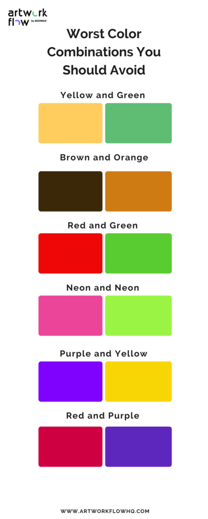
Color pairing may seem like a child’s game, but it’s actually a complex art that requires skill and knowledge. Unlike what we learned as kids with crayons and markers, color pairing is not just about experimenting with different hues. It’s about creating harmony in an environment or expressing our personality through clothing.
Why Color Pairing Matters
Color pairing is more than just aesthetics; it can evoke emotions, create a specific atmosphere, and even influence our mood. When we wear clothes that don’t complement our skin tone, we may come across as unconfident or unpolished. Similarly, when a room’s color scheme clashes with its surroundings, it can be off-putting to visitors.
Understanding Color Theory
Color theory is the foundation of color pairing. It explains how colors interact with each other and how they affect our emotions and surroundings. There are three main types of color: primary, secondary, and tertiary.
- Primary Colors: Red, yellow, and blue are the basic colors that cannot be created by mixing other colors together.
- Secondary Colors: Orange, green, and violet are created by mixing two primary colors together.
- Tertiary Colors: Yellow-green, blue-green, red-orange, and red-violet are created by mixing a primary color with a secondary color.
Common Color Pairing Mistakes to Avoid
Before diving into the world of color pairing, let’s explore some common mistakes to avoid:
- Mixing too many colors: Limit yourself to two or three colors at most. This will help you create a balanced and harmonious look.
- Matching primary colors: Avoid pairing primary colors (red, yellow, and blue) as they can create an overwhelming effect.
- Pairing metallic colors with pastels: Metallic colors like gold and silver don’t mix well with soft, delicate hues like pastel pink or baby blue.
- Combining warm and cool tones: Mixing warm (orange, red, yellow) and cool (blue, green, purple) colors can create an unstable look.
Classic Color Schemes: A Reference Guide
When it comes to color pairing, there are certain schemes that have stood the test of time:
- The Color Wheel: This ancient diagram illustrates how colors relate to each other. The primary colors (red, yellow, and blue) can be mixed to create secondary colors (orange, green, and violet).
- Itten’s Circle: This colorful circle divides into three main sections: reds, yellows, and blues. These colors can be combined in various ways to create a harmonious palette.
- Idden’s Wheel: Similar to the color wheel, this diagram helps you determine which colors are adjacent to each other on the color spectrum.
Bright Colors: A Delicate Balance
When working with bold, vibrant colors, it’s essential to strike the right balance:
- Balance warm and cool tones: Pair bright colors like orange or red with neutral shades like beige or gray.
- Avoid over-saturation: Don’t overload your outfit or space with too many bright colors; this can create a chaotic atmosphere.
Your Skin Tone: A Personal Guide
Consider the following tips when choosing clothes that complement your skin tone:
- Cool tones: Look for colors like blue, purple, and green to enhance your complexion.
- Warm tones: Try pairing with warm colors like orange, yellow, and red to create a cohesive look.
Conclusion: Mastering Color Pairing
Color pairing is an art that requires patience, practice, and self-awareness. By understanding the basics of color theory and common mistakes to avoid, you’ll be well on your way to creating stunning looks that reflect your personality.
Frequently Asked Questions (FAQs)
-
What’s the best way to start pairing colors?
Start by experimenting with different combinations using online tools or consulting with a stylist.
2. How can I balance warm and cool tones in my wardrobe?Try mixing neutral shades like beige or gray with bold, vibrant colors to create contrast and visual interest.
-
What are some popular color schemes for spring and summer?
Earthy tones like olive green and terracotta are great for spring, while pastel hues like lavender and peach are perfect for summer.
4. How can I determine my skin tone?Check your wrist veins; if they appear blue or purple, you have a cool undertone. If they appear green, you have a neutral undertone.
-
Can I wear bold colors with dark skin tones?
Absolutely! Dark skin tones can pull off a wide range of colors, including bold, vibrant hues.
6. What’s the best way to store my clothes to keep them looking fresh?Hang your clothes in a well-ventilated area, away from direct sunlight. Avoid over-drying or wrinkling your garments by using breathable storage bags or containers.
-
How often should I update my wardrobe?
Aim to refresh your wardrobe every 6-12 months to stay on-trend and prevent style stagnation.
8. Can I wear metallic colors with other metallics?While it’s technically possible, mixing metallic colors can create an overly flashy look. Stick to one or two metallic pieces per outfit for a more understated effect.
-
What are some popular color combinations for autumn and winter?
Rich, earthy tones like burgundy, navy blue, and charcoal gray are perfect for autumn, while deep, jewel-toned colors like emerald green and sapphire blue are great for winter.
10. How can I create a cohesive wardrobe look?Start by identifying your personal style and color palette. Then, focus on building a solid foundation of neutral pieces that can be mixed and matched with bold, statement items.


